
The original idea sounded simple:
Take an old elevator-style indicator and make it into a clock.
That was the promise. That was also the problem.
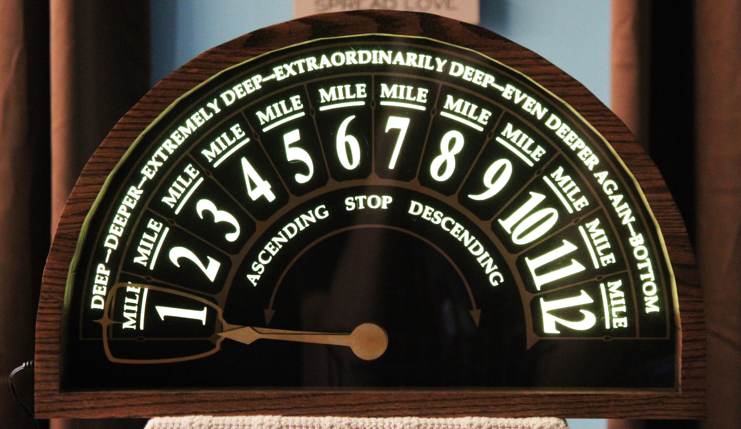
Old elevator indicators are beautiful because they are simple. A semicircular face. A row of numbers. A single pointer sweeping from one side to the other. At a glance, you know where you are.
Clocks are also beautiful because they are simple, but they work differently. A standard analog clock is circular. The hands rotate continuously around a center shaft. Every number lives somewhere around a full 360-degree face.
An elevator indicator does not have that geometry. It sweeps across an arc.
So the first real design question was not, “How do I make it look like an elevator indicator?”
That part was relatively easy.
The real question was:
How do I make it read like a clock?
Floors Become Hours
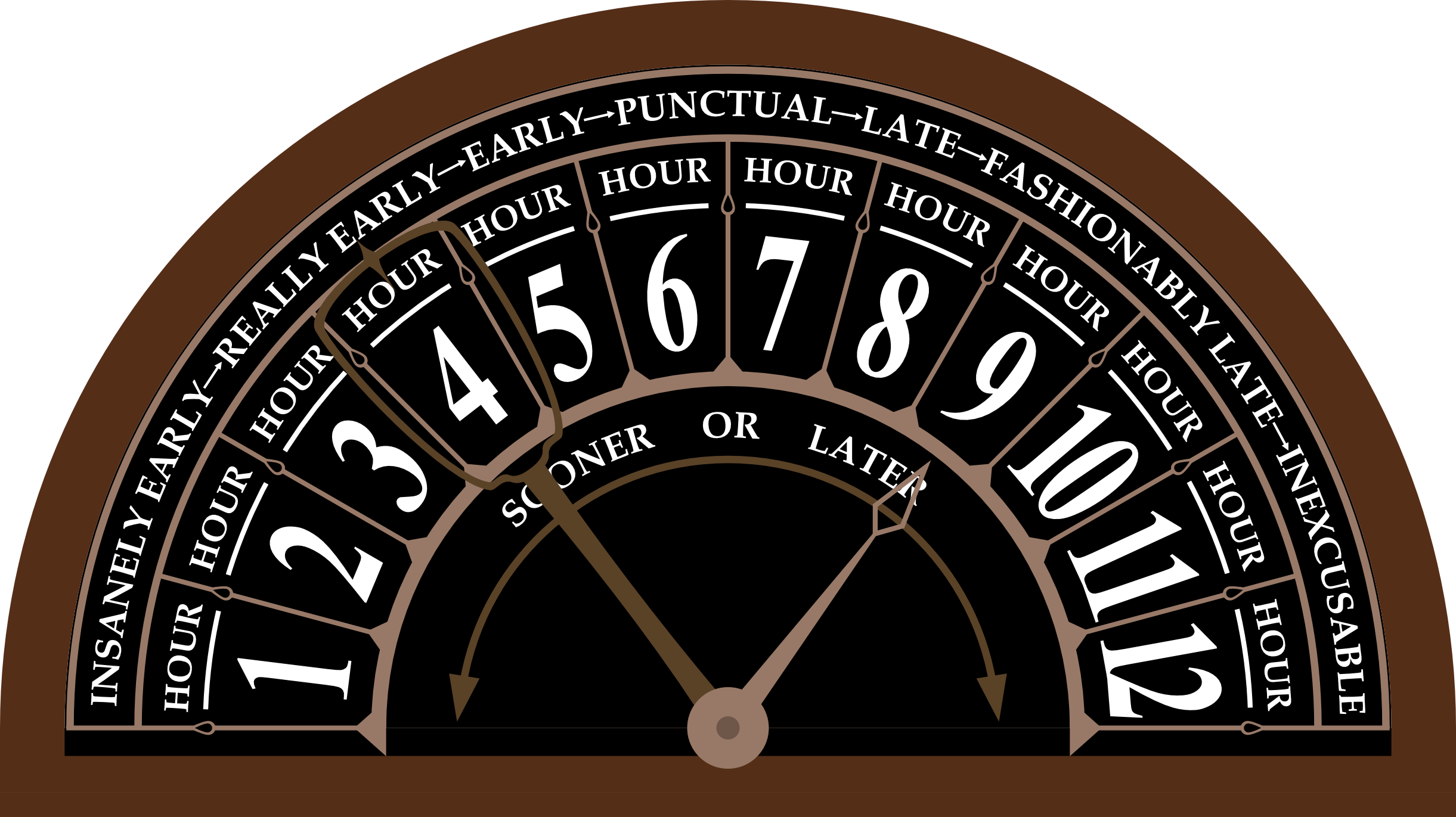
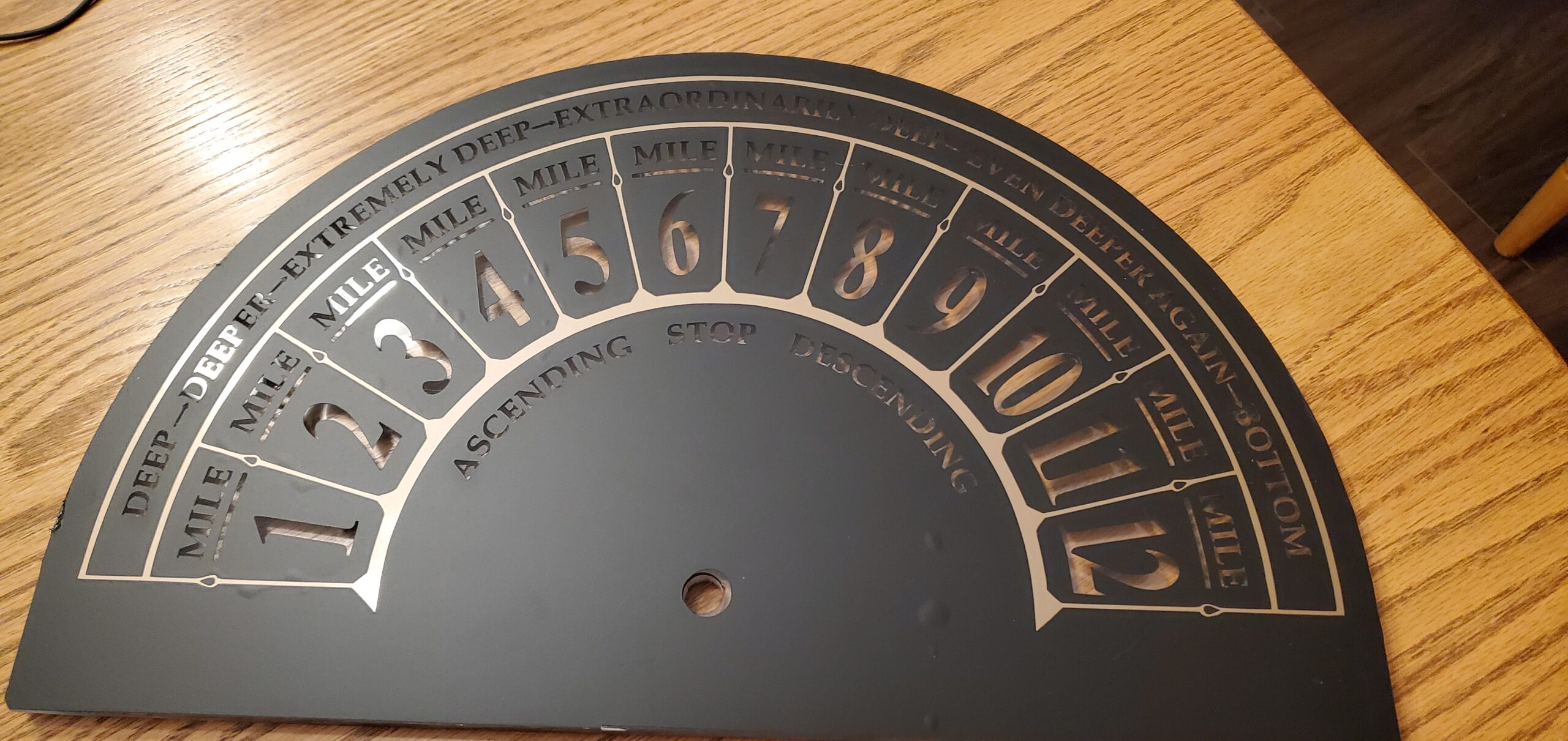
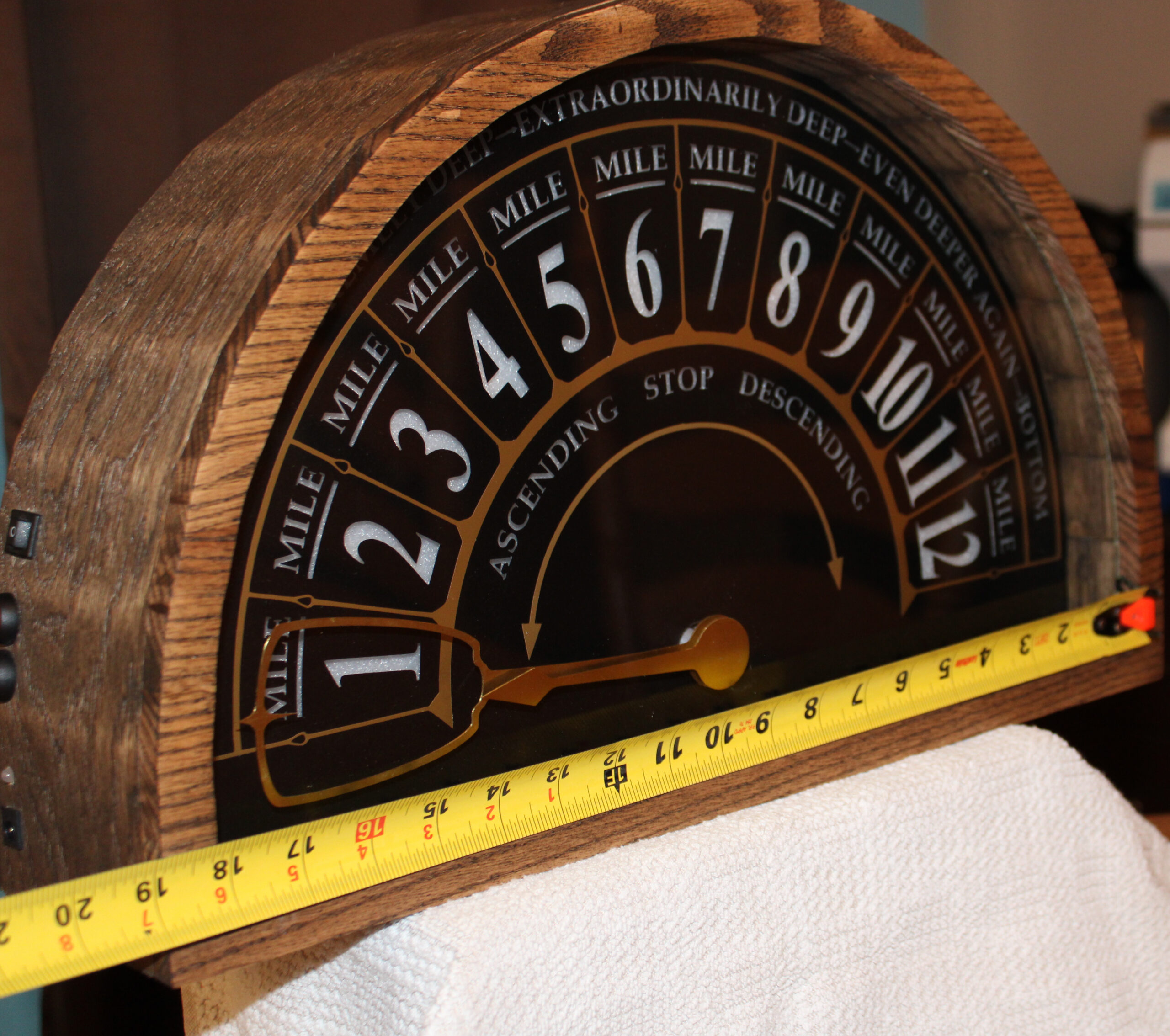
The most obvious decision was to replace the floor numbers with hours.
Instead of showing floors, the face would show 1 through 12 across the semicircular arc. The clock would still be read much like an analog clock, but the numbers would be laid out along a sweep rather than around a circle.
That gave the clock its basic visual identity.
It also created the first constraint: both hands needed to operate on the same semicircular scale.
The hour hand should point to the current hour. If it is 3:00, the hour hand should point to 3. If it is 8:00, it should point to 8.
The minute hand should move across the same 1-to-12 scale, just like it does on a normal clock. At 15 minutes past the hour, it should point near 3. At 30 minutes past, it should point near 6. At 45 minutes past, it should point near 9.
In other words, the face would be semicircular, but the reading logic would still be familiar.
The Illusion of Simplicity
From the outside, the clock needed to feel obvious.
That was important to me. I did not want it to become a puzzle clock where you have to explain the rules before anyone can read it. The whole point of borrowing the elevator indicator form was that it was already intuitive.
A pointer points to a number. You understand it immediately.
But inside the clock, that simplicity created a mechanical problem.
A normal clock can stack its hands on a shared central shaft because both hands rotate through the same circular path. They are different lengths, and they move at different speeds, but they share the same basic geometry.
This clock could not rely on a normal clock movement. The hands needed to sweep across a semicircle, not rotate endlessly around a full circle. More importantly, the hour and minute hands had to move independently while still appearing to share the same visual origin.
The clock needed two independently controlled hands.
That meant two motors.
That meant custom geometry.
That meant this was no longer just a decorative case around an off-the-shelf clock movement.
Two hands, two jobs
I decided early that the clock would have two hands:
- an hour hand
- a minute hand
The hour hand’s job is simple: point to the current hour.
The minute hand’s job is to travel across the same arc over the course of each hour. Since the face is labeled 1 through 12, the minute hand can use the same visual convention as a normal analog clock. When it points to 12, it is at the top of the hour. When it points to 6, it is half past.
This made the clock readable without changing how people think about time.
It also created a nice visual effect. The two hands move in the same world, but they are not doing the same thing. One marks the current hour. The other shows progress through that hour.
Designing for the Object, not just the Mechanism
Before getting too deep into the mechanism, I had to decide what the clock should feel like as an object.
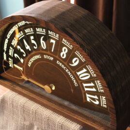
The inspiration was an old elevator indicator, so the materials needed to support that. I wanted the finished clock to have some warmth, some weight, and some vintage character. Not a replica of anything specific, and not a prop, but something that felt like it belonged in the same design family.
The final material palette came from that goal:
- oak veneer plywood for the main case
- recovered oak flooring for the front trim
- an acrylic front plate
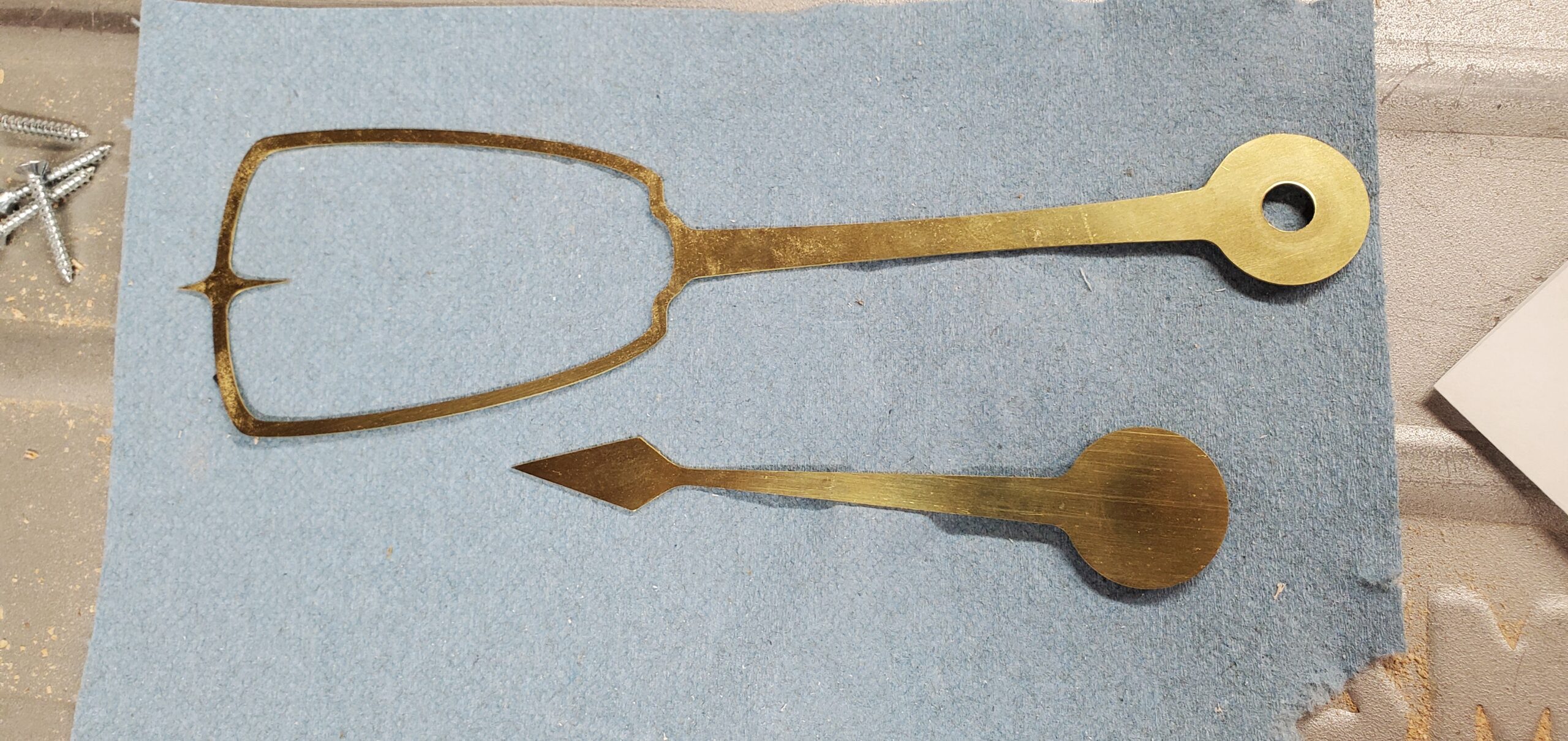
- custom cut brass hands
- an clock face with backlit numbers
- brass vinyl accents
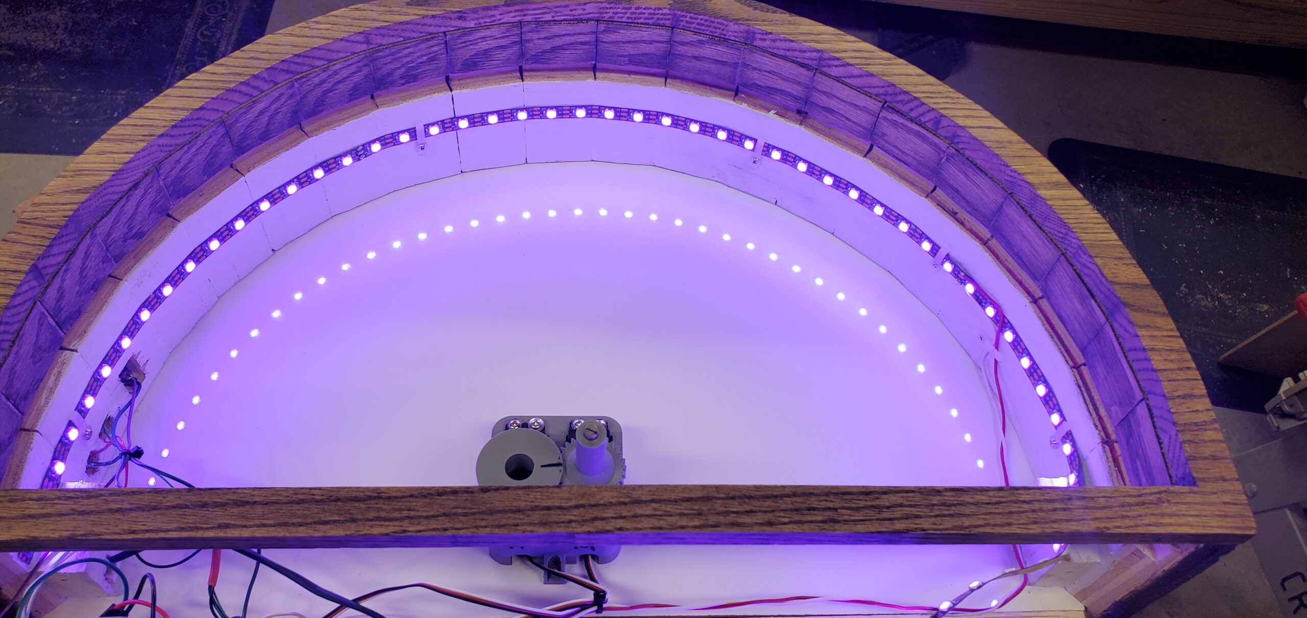
- LED backlighting diffused through cellular foam
The wood would give it warmth. The brass would make the hands feel more like an instrument than a toy. The black face and metallic accents would give it contrast. The LEDs would add a little bit of theater without becoming the main event.
Backlighting the Numbers
The lighting was decorative, but it still had a job to do.
I wanted the clock to glow from behind the face, especially through the numbers and accents. That meant the front face could not just be painted or printed. The light needed somewhere to come through.
The solution was to use clear acrylic as the base, then apply matte black vinyl with the numbers cut out. “Brass” vinyl accents were layered on top for the decorative details.
Behind the clock face, I added cellular foam to diffuse the LED light. Without diffusion, LEDs tend to create hot spots: bright dots where each individual LED sits. The foam helped spread the light so the face would glow more evenly.
The LED strip runs around the side of the arc and along the bottom of the clock, behind the face. It is not part of the timekeeping mechanism, but it does a lot for the final look.
The Size of the Thing
The finished clock is about 19.5 inches wide and 12 inches tall.
That size mattered. Too small, and the elevator-indicator idea would feel like a novelty. Too large, and it would become difficult to build cleanly, especially with the curved case and custom face.
At this scale, the hands are large enough to feel intentional, the face has room for decoration, and the clock can function as a real wall piece rather than a small desktop experiment.
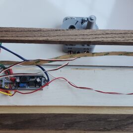
It also gave me more than enough internal space for the electronics, servos, wiring, lighting, and the custom mechanism that would eventually drive the hands. Of course, special care was taken not to block the LEDs and cause shadows around the edge.
The real design problem
By this point, the outer concept was clear.
It would look like an old elevator indicator. It would use hours instead of floors. It would have two hands. It would be backlit. It would be made from wood, acrylic, brass, vinyl, and a handful of electronics.
But the hardest part was still unresolved.
How do you make two hands move independently across the same semicircular face?
The hour hand was straightforward enough. It could be driven directly.
The minute hand was the interesting part.
It needed to move independently, but it also needed to appear to share the same center area as the hour hand. A normal stacked clock shaft was not going to solve that problem. I needed a custom mechanism that allowed one hand to move around the other without interfering with it.
That mechanism became the heart of the project.
It involved two servos, a custom gear arrangement, 3D-printed parts, and a minute hand driven by a gear that slips around the hour-hand shaft.
That is where the project stopped being just a themed clock and became a real mechanical design challenge.
And that is the next part of the story.
Recent Comments