The two illuminated pillars were finished. The buttons worked. The lights cycled, breathed, and pulsed exactly as intended.
But something was missing.
Placed beside the existing doors, the pillars looked like two impressive props. They did not yet feel like a complete entrance into another world.
The original design called for an arch spanning the doorway, but time was disappearing quickly. With the deadline approaching, I was not sure the arch was going to happen at all.
Then I found a way to build it quickly.
The Piece That Completed the Illusion
The pillars supplied the interaction. The arch supplied the immersion.
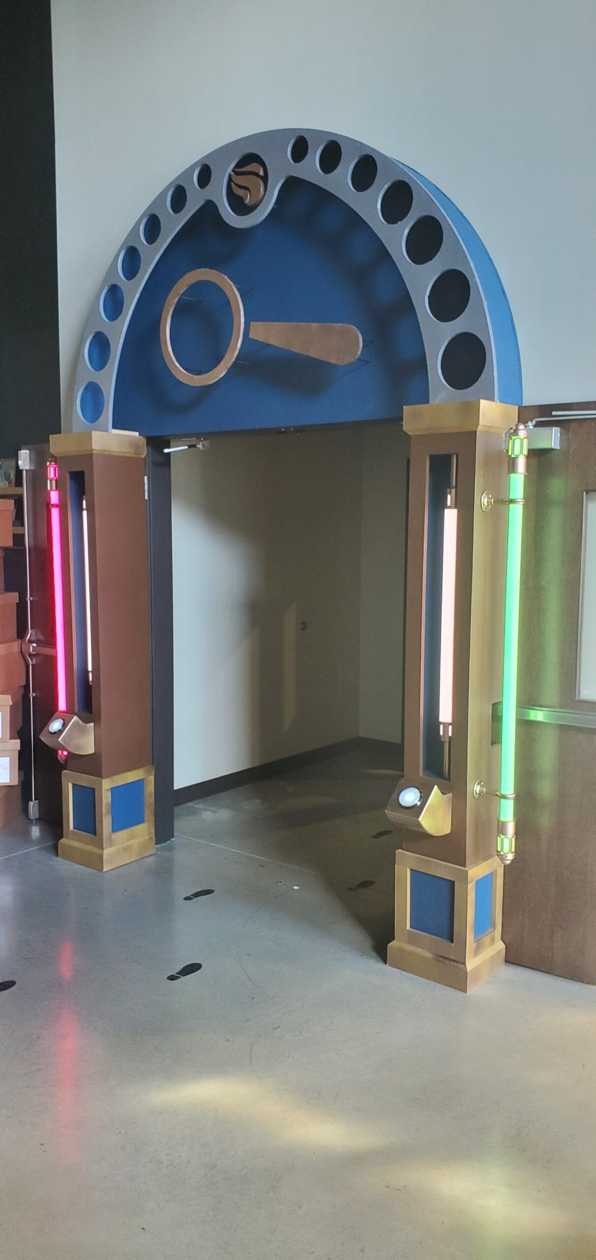
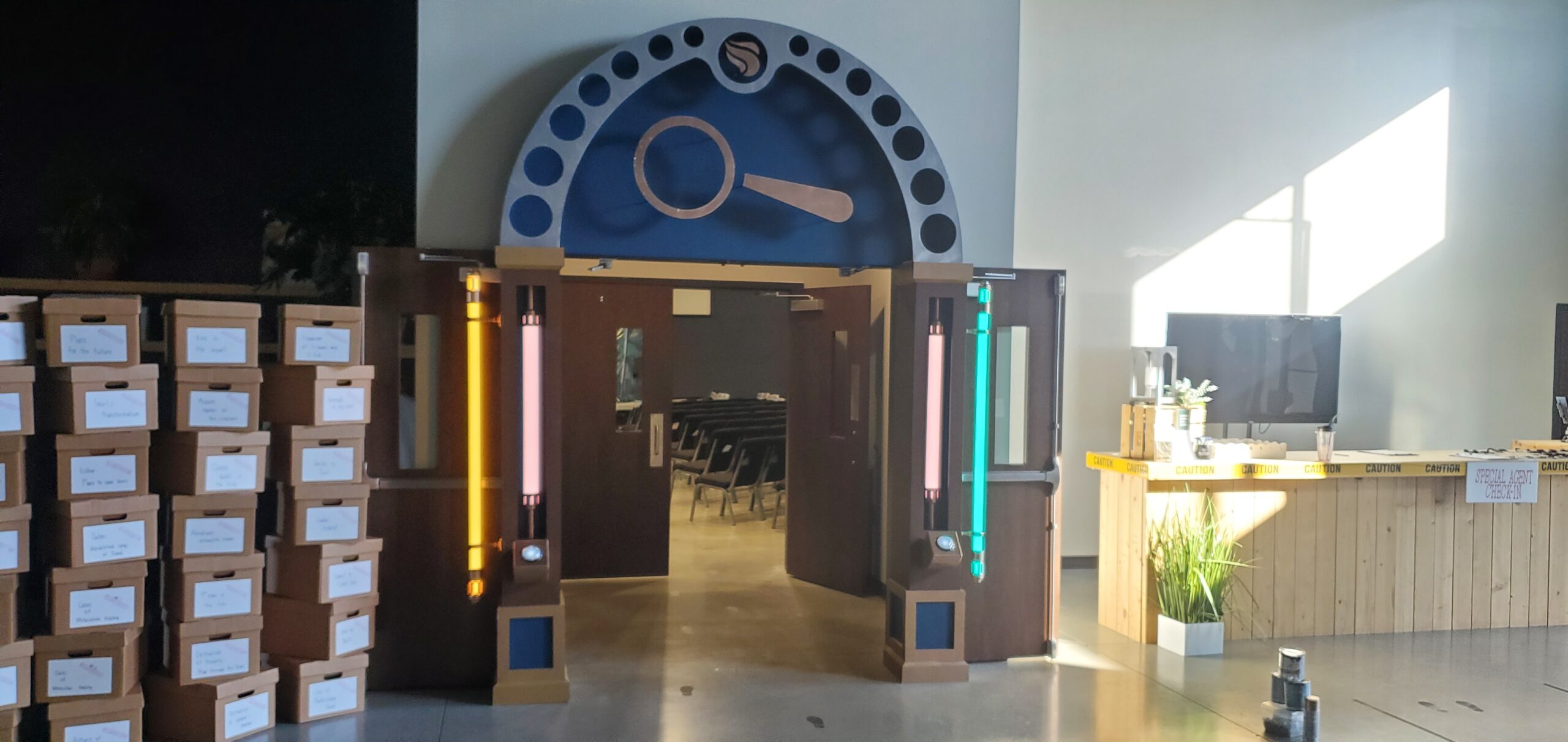
Its shape enclosed the doorway, visually connected the two sides, and transformed the installation from a pair of machines into a single facade. Passing between the pillars now meant passing beneath something as well. The ordinary doors became a threshold.
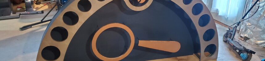
The design was intended to resemble a large steel beam with holes cut through it. At the center was an oversized magnifying glass, connecting the facade to the VBS program’s Sherlock Holmes influence. Above it floated the church’s logo.
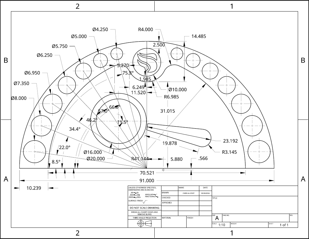
The CAD drawing placed the arch at approximately 91 inches wide. Building a curved, layered structure of that size from wood would have required more time, more weight, and a more substantial mounting system than the project could support.
Instead, I used one-inch insulating foam.
Sweeping a Seven-and-a-Half-Foot Curve
The greatest challenge was cutting the large arcs accurately.
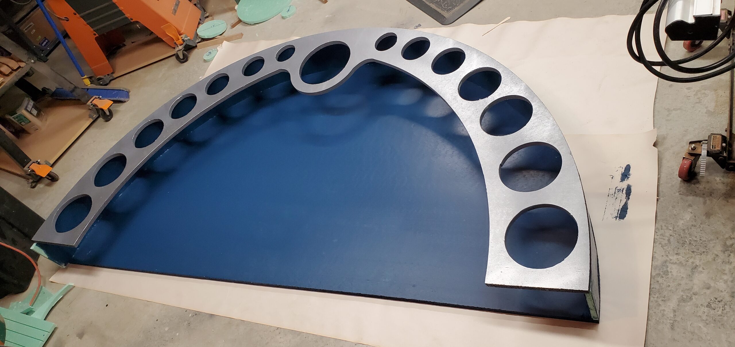
A normal router jig was far too short, so I built a long arm that allowed the router to sweep across the foam like an enormous compass. That established the primary curves of the arch.
The row of circular openings required a different jig. I built an adjustable router fixture that allowed me to change the radius for each hole. The openings gradually change size as they move around the arch, which helps sell the impression of a designed structural beam rather than a flat piece of scenery.
All of the holes were cut completely through the foam.
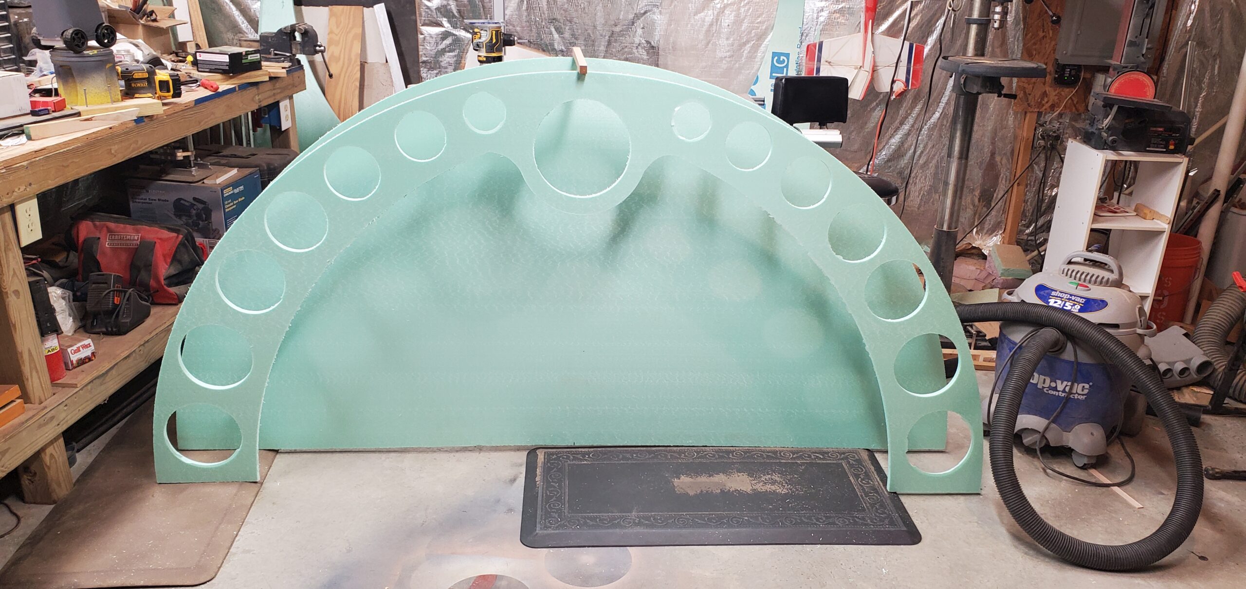
The arch was built in layers. A blue foam backing filled the semicircular area above the doors. The perforated outer beam sat in front of it, giving the design depth and making the openings clearly visible.
The layered construction looked substantial from the floor while remaining light enough to transport and mount safely.
Making Foam Look Like Metal
Fresh insulating foam does not look much like a steel beam, but paint can do a remarkable amount of work.
I began with a gray base coat. Over that, I added blue and purple tones to give the surface more variation and depth. A final layer of silver created the metallic appearance.
The finish was not intended to make the arch look pristine. The variations in color helped it feel like a large piece of fictional machinery—something that belonged with the brown, brass, copper, and blue pillars below it.
The magnifying glass and church emblem were also cut from foam. Rather than attaching them directly to the blue background, I mounted them on dowel rods so they appeared to float in front of it.
That small separation created real shadows and gave the otherwise lightweight construction a surprising amount of dimensionality.
With the exception of the dowel rods and the wooden mounting plates, the entire arch was foam.
Carefully Fitting It into a Minivan
The full facade consisted of three large components: two pillars and the arch.
All three fit into the back of our family minivan.
Carefully.
The arch was attached to wooden plates at the top of the pillars and secured with screws. Because the pillars were already sturdy (and perhaps slightly overbuilt) they provided a solid foundation for the very lightweight structure above them.
Once the arch was in place, the project finally looked like the original idea.
Building the Feeling, Not Just the Prop
The arch did not contain any electronics. It did not move, flash, or react when a child pressed a button.
Even so, it may have been the element that made the whole installation work.
Without it, the pillars were interesting objects standing beside a door. With it, the entire wall became part of the theme. The magnifying glass reinforced the Sherlock Holmes mystery, the steel-beam shape supported the steampunk aesthetic, and the arch created a clear boundary between the ordinary space outside and the VBS experience beyond it.
That is an important lesson for themed builds: not every element needs to be interactive. Interactivity gives people something to do, but visual framing tells them where they are.
The buttons created excitement. The lights provided a response. The arch created the world around them.
The Value of the Last-Minute Piece
I was thrilled with how quickly the entire facade came together. The MDF pillars went up faster than expected, the 3D-printed details gave them a level of finish I loved, and the lighting behavior worked the way I had imagined.
But the rapid construction of the arch may have been the most satisfying solution of all.
It would have been easy to decide that the pillars were good enough. They already lit up. They already responded to the children. They already met the functional request.
The arch was not strictly necessary for the button to work, but it was necessary for the experience to feel complete.
Built quickly from inexpensive foam, it became the largest and most visually unifying part of the facade. It is also a good reminder that when a project feels unfinished, the answer is not always another complicated mechanism.
Sometimes it just needs the right frame.
Recent Comments