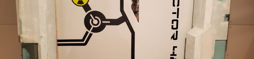
In the Pixar movie Cars, Lightning McQueen earns the nickname “Stickers” because his headlights are not real. They are just stickers.
We can call them decals, vinyl graphics, identification markings or visual communication elements. Those terms all sound much more sophisticated.
But, in the end, they are just stickers.
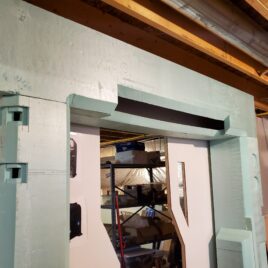
That does not mean they are unimportant. Lightning McQueen would look incomplete without his headlights, and my airlock looked incomplete without its graphics. The plain white melamine doors worked perfectly well as a barrier, but they still looked like two plain white doors surrounded by an increasingly elaborate foam facade.
The stickers transformed them.
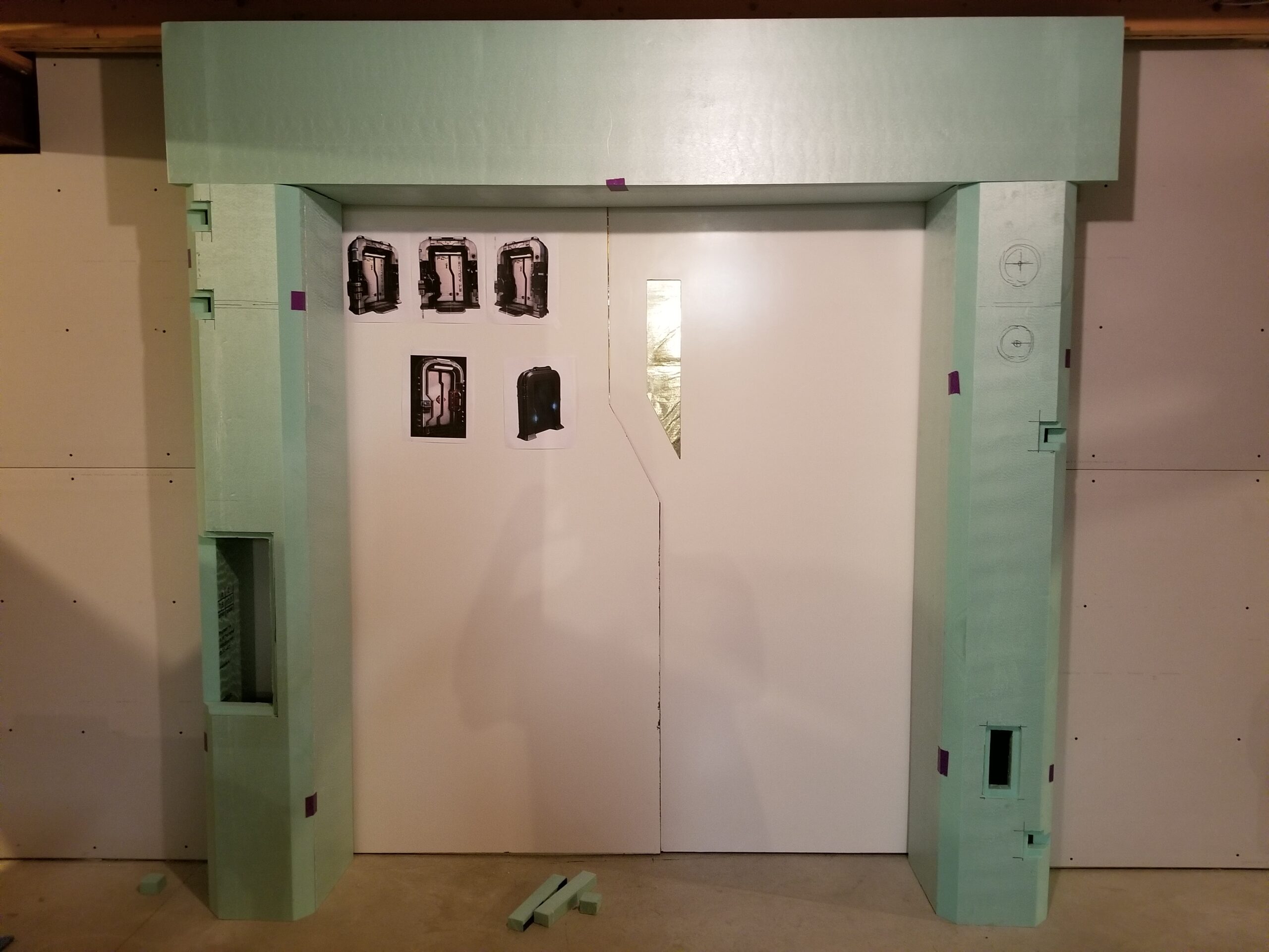
Three Designs
There were three main vinyl graphics: a pair of directional arrows near the bottom, a large graphic spanning much of the left door, and the “SECTOR 42” identification on the right.
Each began in Affinity Designer. Unlike much of the foam facade, these graphics were fully designed before construction began. I carefully measured the available space, worked out the proportions and prepared the individual pieces for cutting.
That was partly necessary because the cutting material came on a continuous roll only 12 inches wide. Any design larger than that had to be divided into smaller sections.
Instead of slicing straight through the graphics and trying to disguise arbitrary seams, I designed intentional breaks into them. Each section could be cut and installed as a complete shape. The limitations of the material became part of the design.
This Way to Open
The simplest graphic was the pair of red arrows near the bottom of the doors.
They point away from the center, indicating the direction in which the doors open. This is probably unnecessary. Most people can figure out how a door works without instructional graphics.
Still, the arrows appeared in the Stertman rendering, and they added a small splash of color near the bottom of an otherwise very white surface. More importantly, science-fiction equipment always looks more convincing when it includes labels explaining the obvious.
A Friendly Radiation Warning
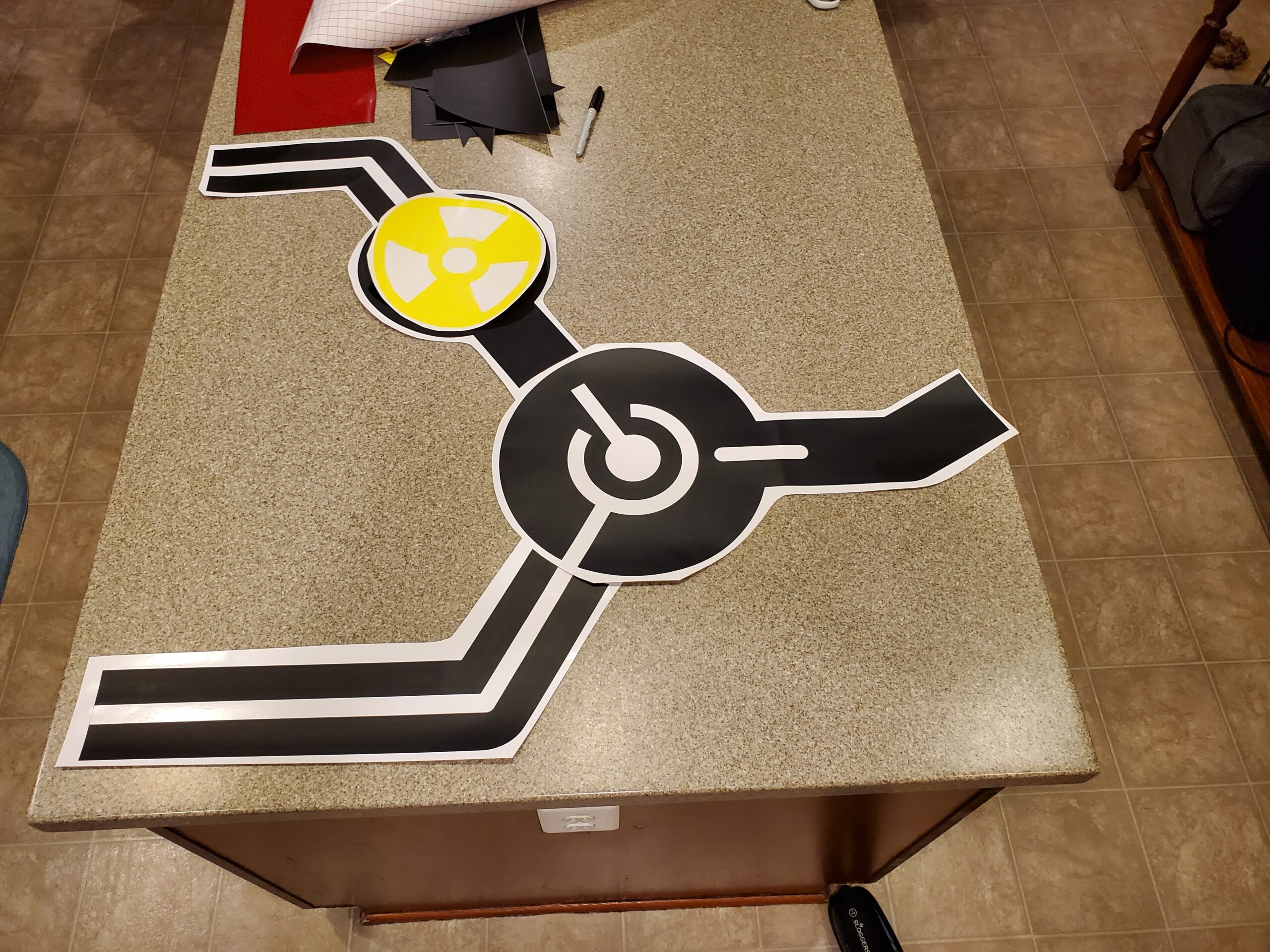
The left-door graphic was inspired by the original rendering, but I did not want to copy it exactly. Stertman’s design included a person wearing a gas mask. It looked appropriately ominous, but that was not quite the atmosphere I wanted outside my workshop.
I substituted a nuclear trefoil.
By itself, however, the radiation symbol felt a little disconnected from the rest of the door. Years earlier, I had seen the logo used by Alienbrain, an asset-management and version-control system designed for artists. I always liked its central circular shape and the lines extending from it.
I used that idea as a starting point and developed an original graphic that stretched across most of the left door.
The complete black graphic was divided into three sections, plus a separate yellow circle (behind the nuclear trefoil). The divisions allowed every black vinyl section to fit within the 12-inch cutting width without introducing seams through the individual shapes.
The nuclear symbol required an additional layer of vinyl. I considered cutting openings so that everything could remain a single layer, but that would have required extremely precise alignment. Even a small error could have left white gaps showing between the colors. Careful overlapping was much more forgiving and reduced the likelihood that small edges would peel up later.
The Answer Is 42
The right door needed some sort of identification.
The Stertman rendering labeled it “Sector 13.” I changed mine to “SECTOR 42,” a reference to The Hitchhiker’s Guide to the Galaxy, in which 42 is the answer to the ultimate question of life, the universe and everything.
Obviously, that makes it the correct sector for a science-fiction airlock.
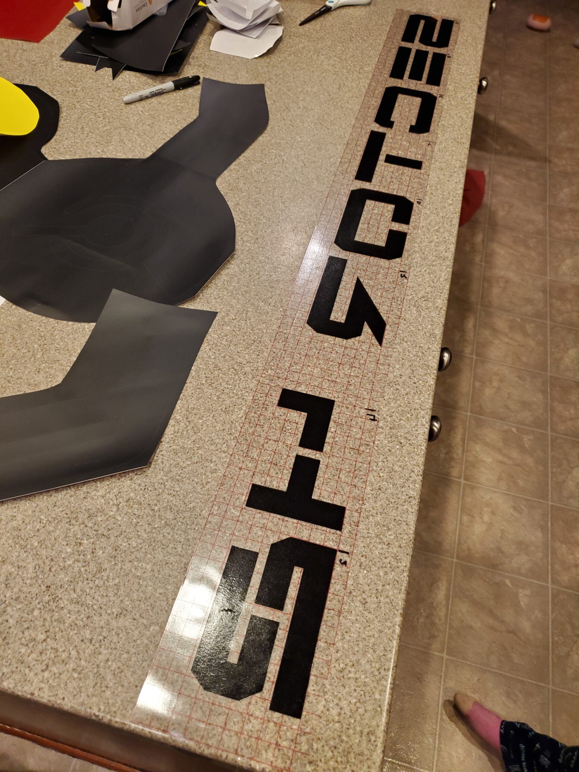
I wanted to preserve the distinctive lettering from the original concept. After using a font-identification tool, I found a match: Free Agent.
Borrowing Mom’s Equipment
I did not own a vinyl cutter, but my mom had a Silhouette cutting machine that could handle the job.
After cutting the designs, I “weeded” all the unwanted vinyl surrounding the graphics. For something like the arrows, this was relatively straightforward. The much larger left-door graphic and the Sector 42 lettering required more preparation.
Working with graphics this large is tricky when you are an amateur. Fortunately, transfer film makes it manageable.
I laid the pieces out on the kitchen counter and used the grid on the transfer material to align them. The transfer film held all the separate vinyl elements in their correct positions while I moved each assembled graphic to the door.
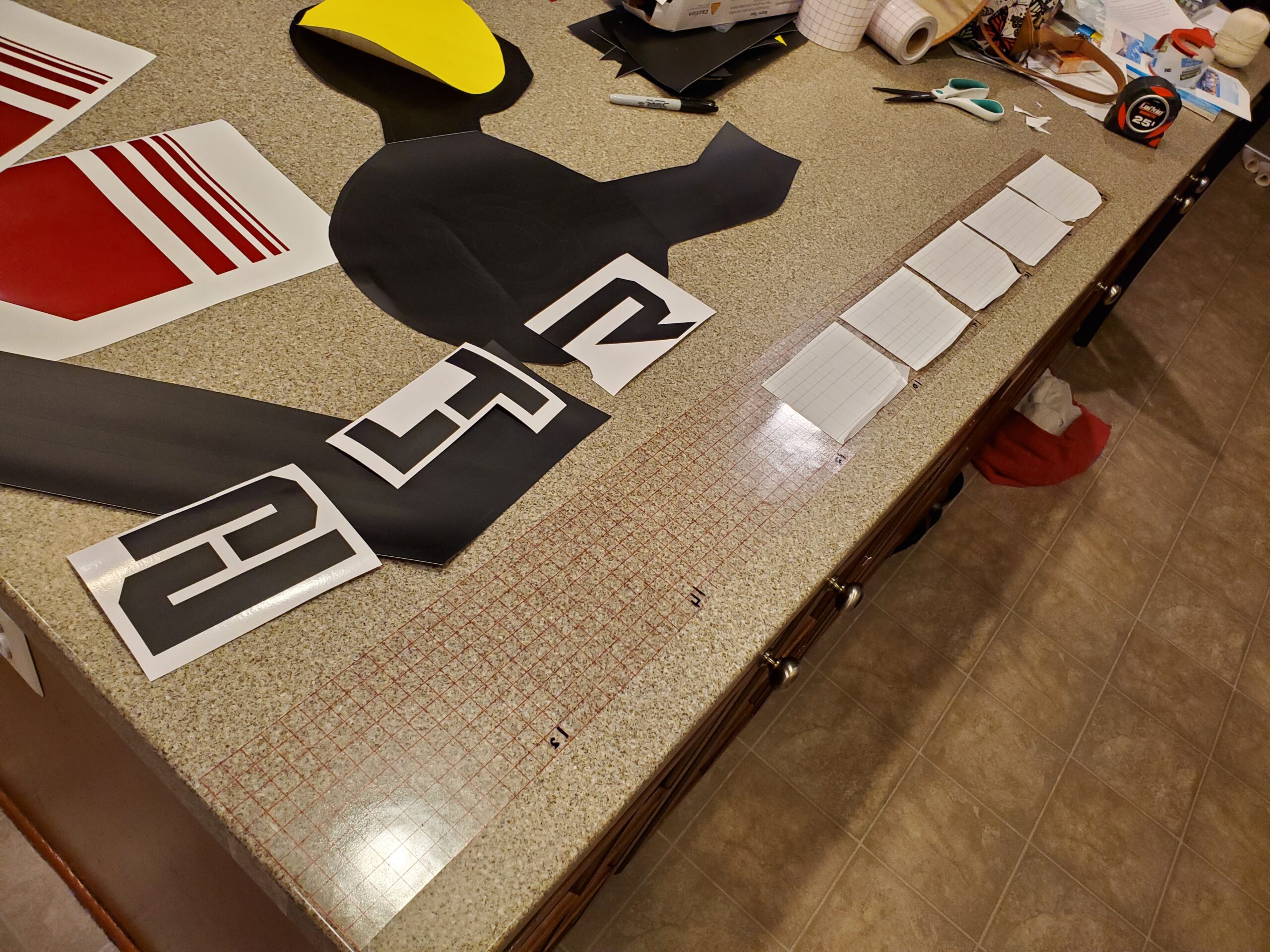
Before installation, I thoroughly cleaned the melamine surfaces. I could then use the light tack of the transfer film to position the design on the door. Once everything was aligned, I gradually removed the vinyl backing and used a squeegee to press the graphic onto the melamine.
Applying it progressively helped prevent bubbles and kept the larger pieces under control. Once the vinyl was secured, I peeled away the transfer film and revealed the finished design.
All three graphics were prepared and installed in roughly one evening.
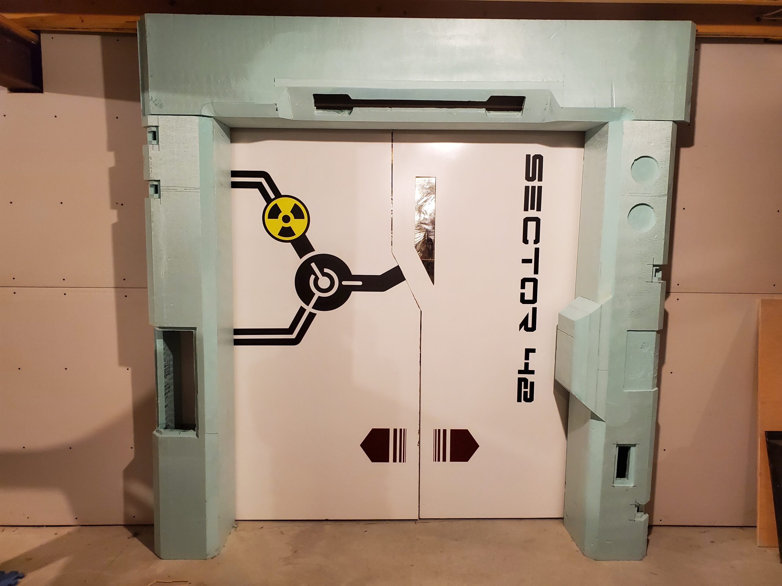
Living on the Edge
The decals dramatically improved the doors, but the unfinished edges still undermined the effect.
I wanted a black trim that could wrap around the irregular shape of each door. It needed to follow the long straight sections, the angled window opening and the unusual geometry near the center. I expected this to be easy to find.
It was not.
The regular internet shopping outlets (some call it Amazon) did not offer anything appropriate, and I did not have a convenient pile of greeblies that suggested another solution. After a great deal of searching, I eventually found the flexible edge material I needed through Outwater Plastics. They were awesome to work with, and the trim did exactly what I needed. Well, almost. It was still just a hard plastic edging. At this point, the door was still manually controlled, and the doors did not close…gently. I really wanted something to absorb the bump…which…so do parents with young children. I found a ribbed foam baby bumper material that was a perfect fit!
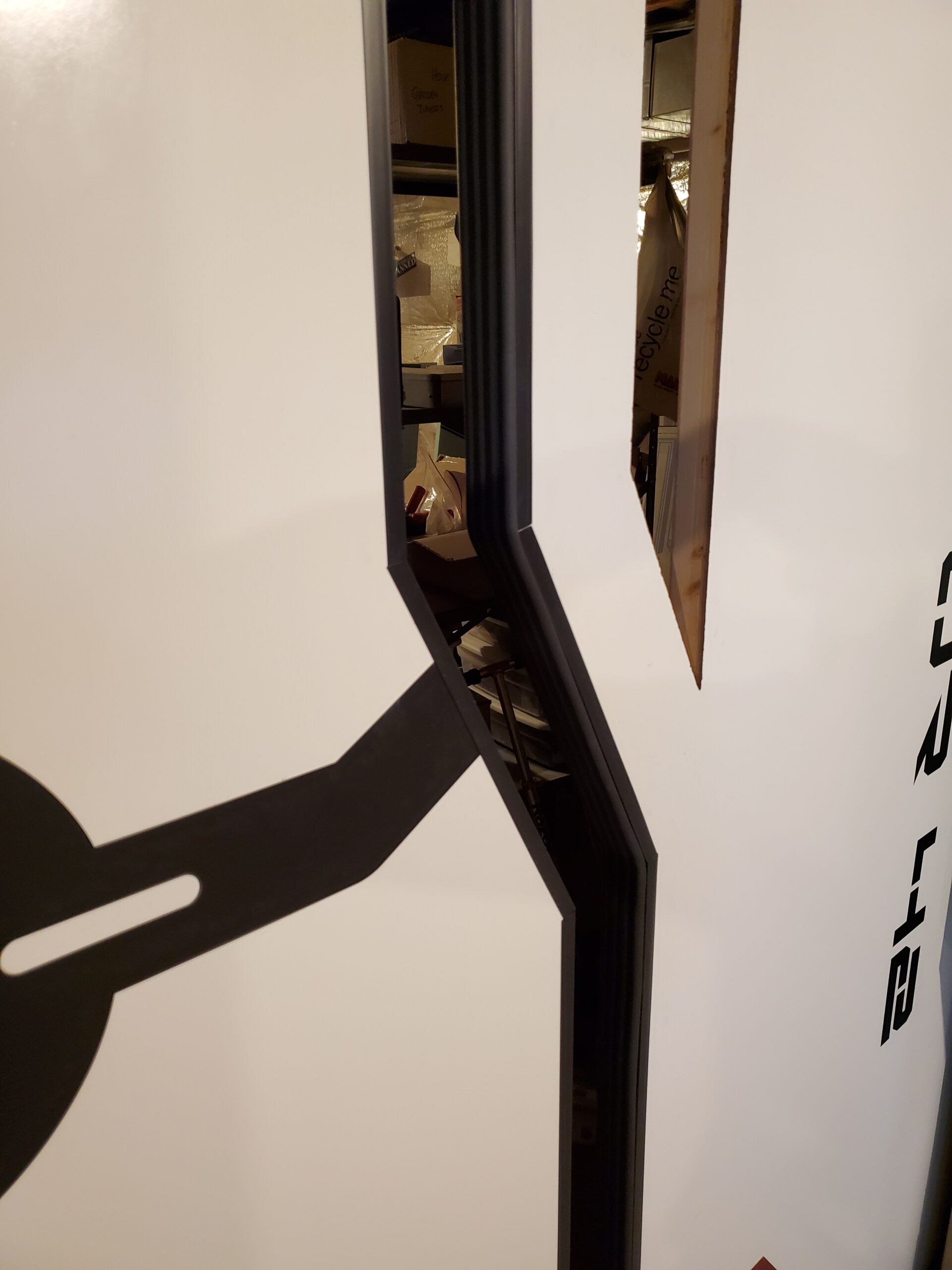
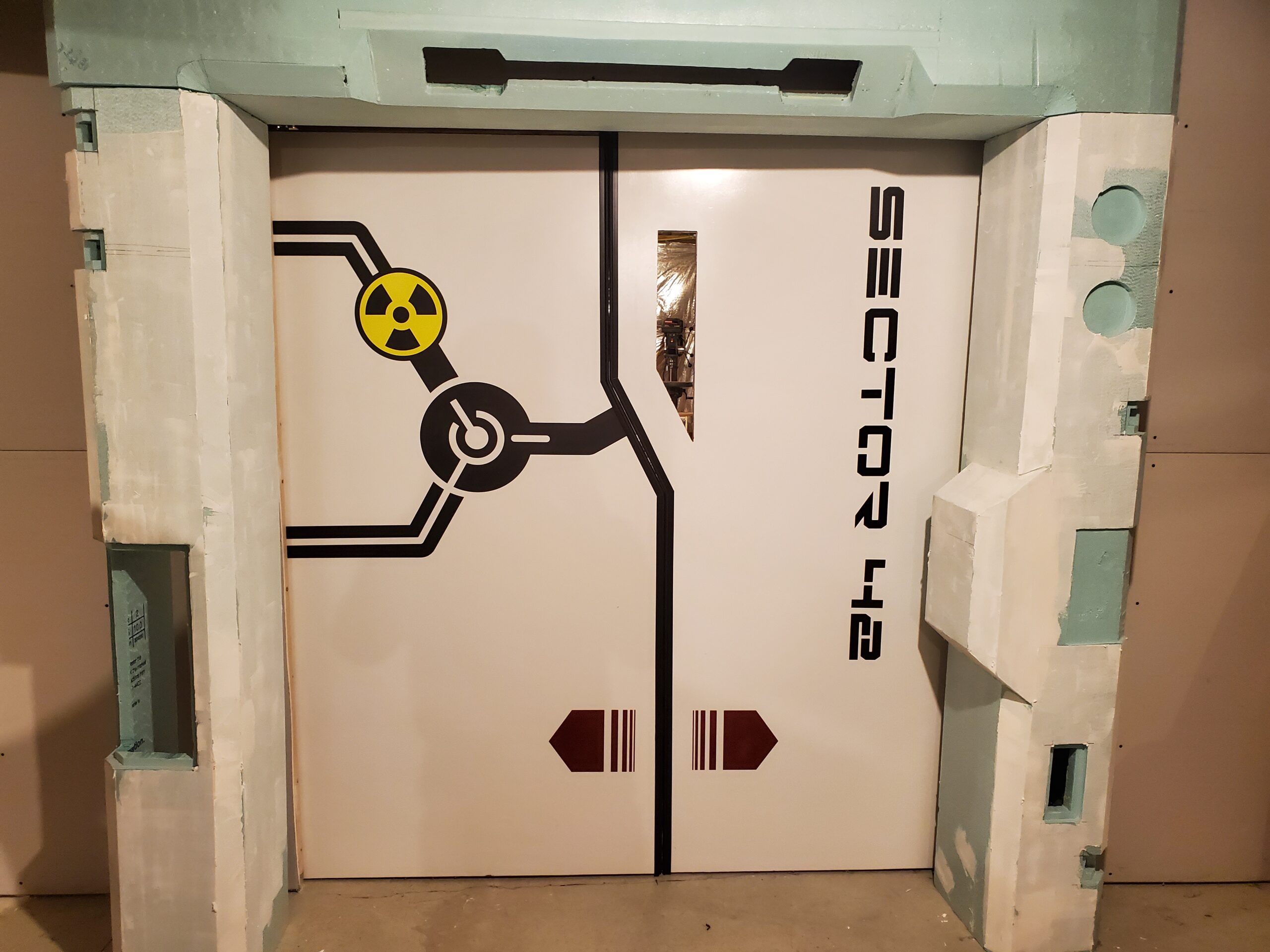
The black edging outlined the door profiles, concealed the raw edges and added a layer of contrast between the two moving panels. It also tied into the black vinyl graphics, making the individual elements feel like parts of one intentional design.
They’re Still Just Stickers
None of the graphics makes the door open. They do not control the lights, monitor radiation or identify an actual sector. The directional arrows provide information that no one really needs.
They are not functional.
But they provide a sense of completeness. They transformed a plain white barrier into something that looks like it belongs inside the larger airlock assembly. The lines give the door visual structure. The radiation symbol suggests a story. Sector 42 gives the doorway a location (even if that location exists only somewhere in the more questionable corners of my imagination).
Sometimes the details that do the least accomplish the most.
They may be just stickers, but the airlock would not look finished without them.
Up Next
So far, most of the airlock’s science-fiction capabilities have existed only in appearance. That is about to change.
In the next post, we will look at the active components: the lights, buttons, switches, sensors, control panel and the wiring that connects everything together.
At least, we will reconstruct as much of that wiring as my memory allows.
Recent Comments